Sunshine Cleaning
The first film poster I will be looking at is the film poster for the film
 Sunshine Cleaning. This film is about a struggling single mother who needs to raise enough money to send her troubled eight-year-old son to private school. With the help of her sister, they venture into the business of crime scene cleaning.
Sunshine Cleaning shares the same theme of the work life of a crime scene cleaner and balancing that with family life and ultimately wanting the best for children’s future. In Sunshine Cleaning the job of a crime scene cleaner is shown to be more upbeat. This is shown through the dialogue as they use jokes and avoid the depressing subject of the job at hand. This is in contrast to our short film which will make it a point that the job of a crime scene cleaner is depressing and dull.
Sunshine Cleaning poster is a cheery film; this is shown by the light colours in the film poster. The bright colours of yellow and blue not only connote the cheeriness of the film but perhaps the femininity seen in the film. The feminine font and the two women seen in the poster also anchor the overall connotation of the film posters femininity.
Use of visual codes of the women and the crime scene police tape contribute towards showing the audience aspects of the plot. This is further shown by the use of the written code of “life’s a messy business”. The poster also features the two main characters that will be seen in the film.
This poster also has the conventional information seen in nearly all film posters. It shows off it’s prestige through the awards it has won and by previous work done by the producers. It also has the written codes of the actors’ names, name of the movie and the release date.
Overall, this film poster shows through it’s visuals that this film is a quirky fun film which will tackle a serious issue in an upbeat manner. The use of bright colours throughout the film poster connote this is a bright and cheerful film.
Shifty
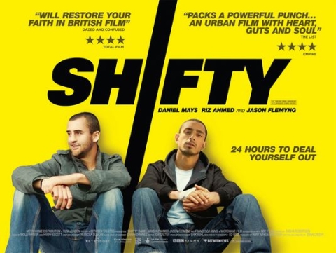
Shifty is a film about a young british crack cocaine dealer whos life is spirailing out of control. Shifty shares in common with our short film it’s britishness and realism. This film also tackles difficult situations which are short film deals with as well.
In shifty there is a dominate bright yellow background colour that immediently grabs attention of all passerbys. The black and bold title is also dominate and signifies that this is a serious film. We may want to immitate the dominance in the use of colour in our film poster as our film shares the same level of seriousness found in this film.
Much like “sunshine cleaning” this poster features the two main actors with the written code of their names. It has the written code of the comments made by respected film review magazines and below those are the amount of stars given to them. Underneath the title is the names of the actors and below those is the slogan of the film.
Walter
I know nothing about this next film poster; I found it when I was searching for
 “short film poster” on Google images. This poster stood out to me not only because it is a striking film poster but because it reminded me of our film.
The poster suggests that there is one main character, Walter, who is seen in the reflection of the butcher’s knife. Our film also has one main character which the film revolves around.
The poster hints towards the plot of the film. The visuals of the butcher’s knife could suggest that Walter is a cook of some kind, or even perhaps he is a murderer and that knife is his weapon. This ambiguity leaves the audience wanting to know who Walter is.
There is the conventional use of written codes in the name of the film and the name of the featuring actors. This poster however lacks any recommendations or reasons to watch it. There are no comments made by others, there are no star ratings and there is no mention of previous work. This could be due to the fact that this is a new film and the people behind the film are all new. Alternatively it could be because this film is rubbish, but I like to stay optimistic.
Looking For Eric

As mentioned before, our film follows one lead male character. This is the same with this film “Looking for Eric”. Although there are two main characters, we are following Eric Bishop who is seen in the bottom left.
Eric Bishop’s placement was done deliberately to work with the plot of the story. With Eric Cantona being huge and light makes him look godlike whilst Eric Bishop being small and in the corner looking towards Eric Cantona shows that he is in awe of him. It works with the plot to show that Eric Bishop worships Eric Cantona.
The conventional quotes, star rating, directors’ name and writer are there. However, actor’s names are missing. This could be because Eric Cantona is already so famous that it isn’t need.
The recurring themes found in all of these posters is the written code of the actors name, the written code of the large title which normally has some sort of graphic associated with it and quotes from respected review magazines with a star rating out of five. The main image normally has something to do with the plot of the film and normally features the lead characters in that film. The colouring of all the film posters normally have one dominant colour, in “Shifty” it’s yellow and in “Looking for Eric” it is red. I will take into consideration these factors when making my film poster.
No comments:
Post a Comment